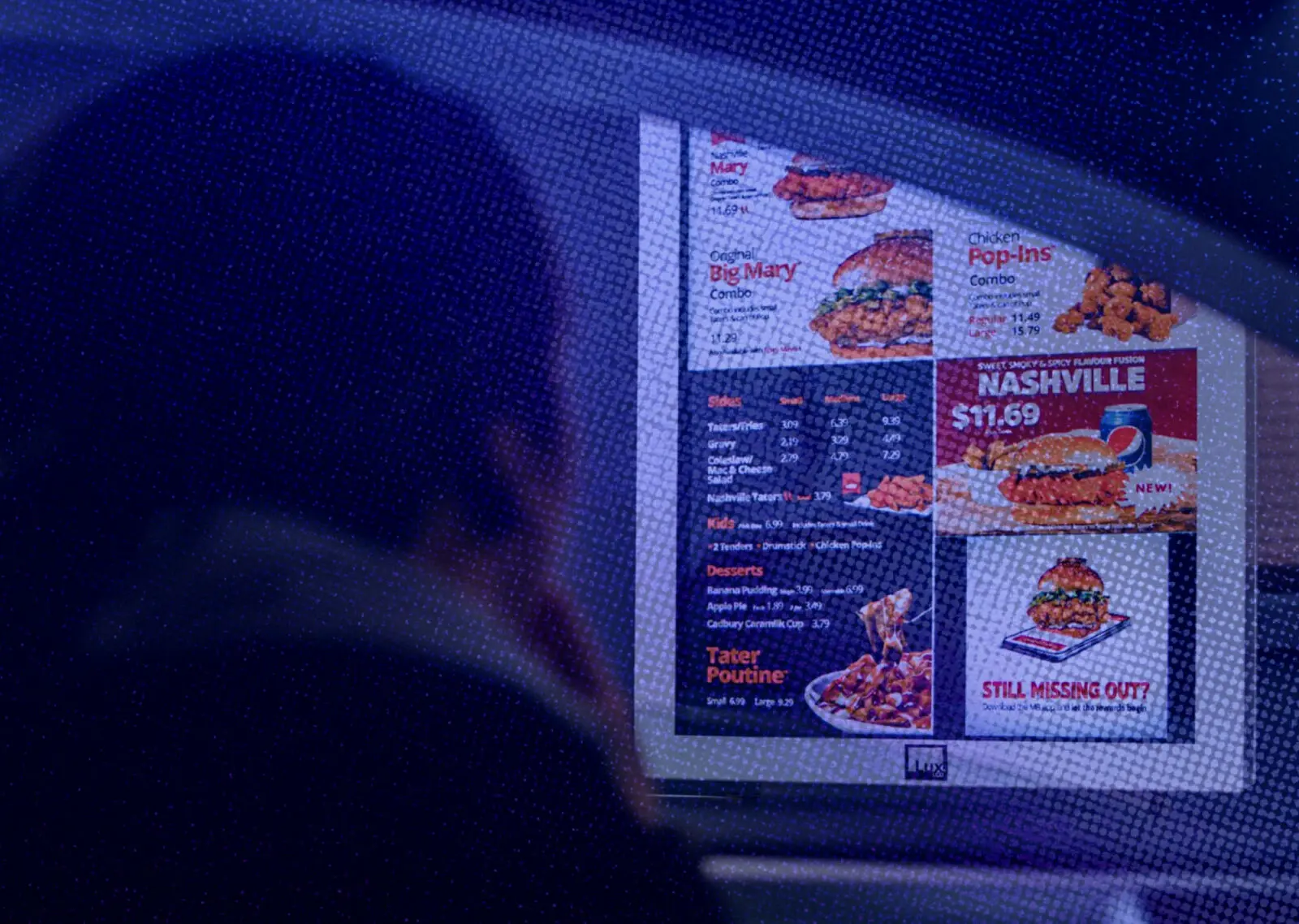
A drive-thru menu has a difficult job. It has to make a broad offer legible while the customer is already moving towards a decision. Categories, names and visual emphasis all compete to answer a practical question: what can I confidently choose next?
Business websites face similar pressure. Over time, their navigation accumulates services, departments, campaigns, audience groups and stakeholder priorities. Each addition may be reasonable on its own. Together, they can make the visitor decode how the organisation works before finding a useful path.
This gives us a useful test for website navigation. Can people recognise and evaluate their next useful path, or do they need to understand the business’s internal structure first?
The comparison only goes so far. A website must also support deep links, exploration, comparison, backtracking and recovery. Those wider responsibilities make clarity more important than simply presenting a compact menu.
Navigation is a decision system
Every navigation label makes a small promise about what sits behind it. The clearer that promise is, the easier it becomes for someone to judge whether the path is relevant.
UX researchers call this *information scent*: the clues people use to estimate where a link is likely to lead. A specific service label usually carries a stronger clue than `Solutions`. A familiar category is easier to evaluate than an internal program name that only the business understands.
This is why navigation can look tidy and still feel difficult. It may accurately reflect the company’s departments or preferred terminology while giving a first-time visitor very little to work with.
Imagine a family visiting a resort website after seeing an ad for a three-bedroom villa holiday. The navigation offers `Stay`, `Experience` and `Discover`. In this example, the labels sound inviting, but their meanings overlap. Villa details sit under `Stay`, family activities under `Experience`, and transfers under `Discover`. To understand the offer, the visitor has to explore the resort’s language one section at a time.
A useful menu reduces that translation work. It uses concepts the audience can recognise and gives enough context to distinguish one route from another. Clearer labels, short descriptions, sensible grouping and relevant page links can all help. The goal is confidence in the next step, rather than instant comprehension of the entire site.
Hierarchy has to earn its place
When navigation becomes crowded, the common response is to remove links or place more of them behind another layer. Sometimes that helps. Sometimes it relocates the difficulty.
Research into choice overload does not support a universal rule that fewer options always produce better decisions. Difficulty also changes with the complexity of the choices, the person’s familiarity, their confidence about what they want and the task they are trying to complete. Five vague, overlapping categories can demand more effort than ten clear ones.
Hierarchy is useful when it reflects genuine priority. Important and frequent routes can appear first, while specialised detail remains available when needed. This is the value of progressive disclosure: staged access to complexity, rather than complexity hidden for its own sake.
The trade-off matters. An extra category such as `Services` can delay access to the meaningful choices beneath it. Too many narrow categories can separate options that people need to compare. A visually simple menu may also bury a frequent route several levels deep, making the structure feel clearer internally while making the visitor’s task harder.
The better review question is whether the hierarchy helps people identify and compare meaningful choices. Link count alone cannot answer that. Teams need evidence from audience language, internal search behaviour, usability tasks and the questions customers repeatedly ask.
Context changes the next decision
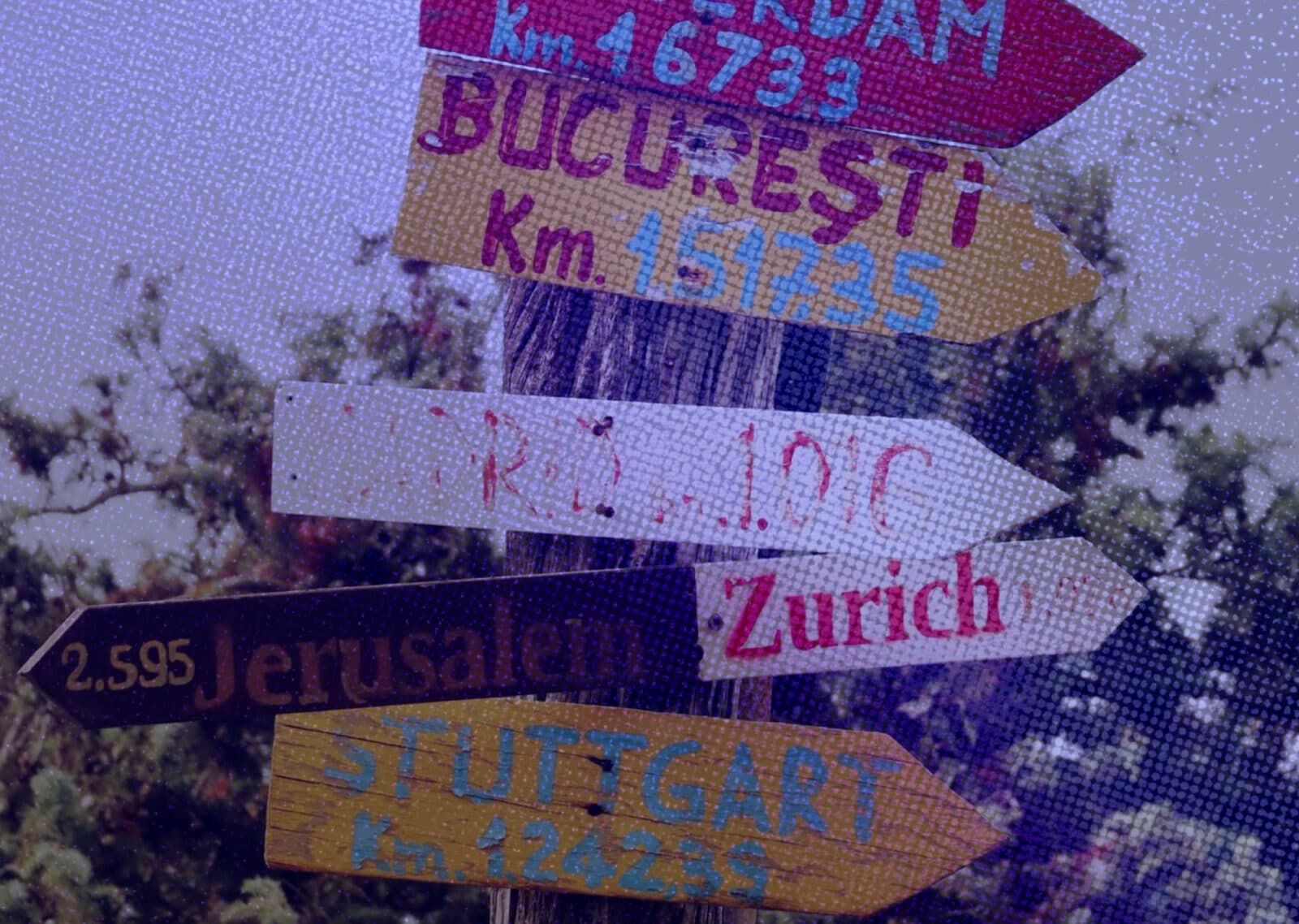
Visitors rarely begin from the same place. One person may enter through the homepage with a broad need. Another may arrive on a deep service page from search. A third may click a campaign built around a specific product or outcome.
That entry context changes what should feel prominent next. The family who clicked the villa ad should reach a page that continues the promise with relevant details, availability, inclusions and a clear next step. Sending them back through the resort’s full accommodation catalogue makes them rebuild a journey they had already started.
Global navigation still has a role. It can help the visitor assess the wider resort, compare related options or recover when the landing page is not quite right. Removing every route may also remove reassurance, particularly when a decision carries cost or requires comparison. A focused page and the broader site have different jobs; the balance depends on what someone needs to understand before acting.
Measurement can guide that decision when its limits stay visible. Menu opens, searches, form starts and exits are diagnostic signals: more activity could indicate useful exploration or confusion. Start with the visitor’s entry route and a clear hypothesis, then connect behaviour to a qualified outcome such as sales-accepted enquiries or converted opportunities.
Form volume alone is too shallow, and a before-and-after dashboard cannot isolate navigation from changes in traffic, campaigns, pricing or seasonality. Task testing and customer language can help explain what the numbers cannot.
Clarity has to survive implementation
The web also has to support people who land on a deep page without the context of a campaign. Current-page states, clear headings, breadcrumbs, search and local links can help them understand where they are and how to recover from a wrong turn. Navigation is part of a wider finding system.
Clarity then has to survive implementation. The intended priority should remain understandable on small screens, by keyboard and through assistive technology. For most sites, that means familiar links and simple expandable sections rather than controls that behave like a software application. Accessibility requirements set essential boundaries, although technical compliance alone cannot prove that the choices make sense.
The structure must survive the business too. New services, campaigns and stakeholder requests tend to arrive faster than old links are retired. A CMS or design system can protect structure, labels and responsive behaviour. It cannot decide which request deserves top-level prominence. Each persistent route needs an owner, a reason to exist and a trigger for review.
The takeaway
The drive-thru test is the discipline of making the next choice legible. Website navigation carries the added responsibility of preserving context, supporting comparison and helping people recover when the first route is wrong.
Begin an audit with visitor decisions. What does someone need to recognise here? What confidence do they need before continuing? How did they arrive, and what would a useful recovery path look like? Then test whether the labels, hierarchy and implementation support those needs—and whether the resulting journeys lead to qualified outcomes.
A tidy internal map is easy to approve. A useful decision system takes more care. The difference is whether the navigation represents the organisation, or genuinely helps its audience move forward.
Explore more
Google Wants Your Property Listings
As Google moves further into property discovery, owned websites still matter for buyer confidence and better enquiries.

Headless Architecture Is Really About Adaptability
Headless architecture separates content from presentation, helping digital platforms adapt across websites, campaigns and customer touchpoints.

When Mobile Stops Being One Column
Foldables show where mobile UX is heading: away from one-column layouts and toward adaptive experiences that preserve context, comparison, and decision confidence.